
A theme-aware preparation guide
Shopify product image size and aspect ratio
Keep every product clear and consistent across Shopify product pages, collection cards, zoom and mobile views instead of chasing one “perfect” pixel number.
See how the same product behaves in square, portrait and wide frames, then decide which silhouette, label, functional detail and negative space must survive each storefront slot.
Build a reusable master-and-derivative workflow for crop safety, product scale, sharpness and catalog rhythm, so the next SKU is easier to prepare without making every product look identical.
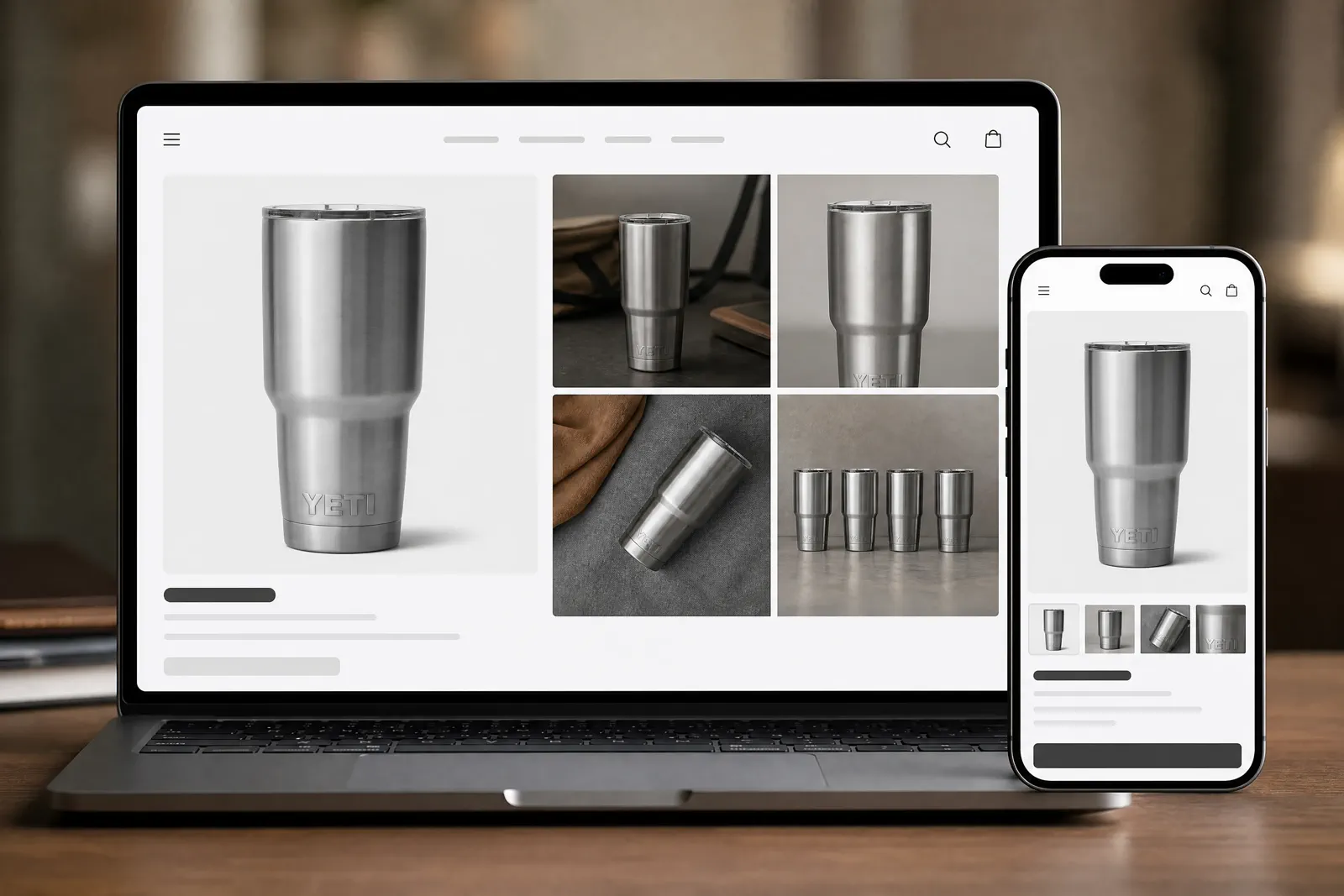
01 · Current requirements
Use Shopify’s current image sizes and limits
Shopify accepts large product images, but the best storefront result comes from combining the upload limits below with a consistent aspect ratio and a crop that suits your theme.
| Field | Current value | How to use it |
|---|---|---|
| Recommended product-image dimensions | 2048 × 2048 px usually displays best for square product images | Use this as a strong square starting point, then check whether the theme crops collection cards, product pages, and mobile views differently. |
| Upload limit | Up to 5000 × 5000 px or 25 megapixels; file size must be under 20 MB | A file must stay within both the pixel and file-size limits. Do not confuse product-media limits with other theme-image upload rules. |
| Supported formats | PNG, JPEG, PSD, TIFF, BMP, GIF, SVG, HEIC, and WebP | Shopify recommends PNG for most product images, followed by JPEG. Choose JPEG for photographic efficiency and PNG when transparency or crisp graphics matter. |
| Aspect ratio | Theme-aware decision | Use consistent catalog rhythm where it serves comparison, then test justified exceptions in the real slot. |
| Rendered crop and product scale | Controlled by the store theme and image placement | Preview the product page, collection card, zoom view, and mobile layout. Keep one aspect ratio for featured images when consistent catalog rows matter. |
Shopify creates multiple image sizes automatically for different storefront uses. The source file limit is fixed, but the visible crop and scale still depend on the theme.
02 · Test the real theme
Preview the same representative products across every storefront view
Use the same products and source files in product-page, zoom, collection, and thumbnail views on desktop and mobile. This makes the theme’s effect on crop and scale easy to see.
Capture the slot ID, viewport, rendered size, crop coordinates, product scale and test date. Compare the same source family so a product or composition switch cannot disguise a crop failure.
Inspect the information each slot must preserve. A PDP hero may need product clarity and useful negative space; a collection card needs comparable scale; a thumbnail must remain recognizable at a small reading distance.
Switch the frame to inspect subject and crop safety
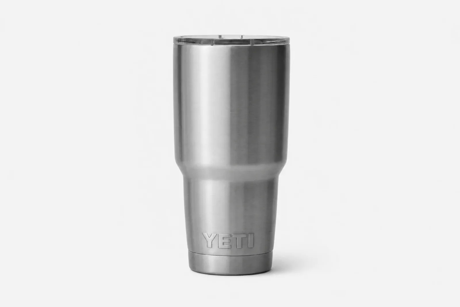 Central safe area
Switch between square, portrait and wide frames; keep the rim, logo, full body and base comfortably inside the safe area.
03 · Choose ratio and scale
Build a consistent catalog rhythm without hiding exceptions
Consistency helps products compare, but the rule must preserve the product details each SKU needs to communicate.
Freeze a crop-safe area
Mark the label, silhouette, functional detail and required negative space on the approved source. Test the overlay in every retained slot.
Compare product scale
Place the same representative products together at collection-card size. Revise a crop that makes one product appear unintentionally larger or smaller than the rest of the catalog.
Keep rejected crops
Record the crop coordinates and reason for rejection. Do not replace the failed state with a prettier image and lose the decision history.
Document a non-square exception
Allow an alternate derivative when product shape or slot behavior requires it. Record what the shared ratio removed and why the exception is safer.
04 · Prepare the file
Preserve the master, then create the slot derivative
Keep the full-resolution source and create each upload file directly from it. Always inspect the result in the storefront instead of assuming the export settings guarantee a good crop.
| Step | Record | Do not assume |
|---|---|---|
| Preserve the master | Source ID, dimensions, profile, approval and rollback version. | That a delivery crop can replace the original. |
| Create the derivative | Slot, crop coordinates, output dimensions and product-scale target. | That one crop serves PDP, collection and thumbnail equally well. |
| Choose the format | Current Shopify support, transparency/color need and tested export. | That a format is supported because another platform accepts it. |
| Upload and inspect | Submitted file, desktop/mobile captures, viewport, date and decision. | That export dimensions predict the rendered presentation. |
| Add alt text | A concise description of the product and meaningful visible information. | That keyword repetition improves accessibility or search performance. |
05 · Diagnose the symptom
Find the cause before resizing again
A crop, blur or consistency problem can come from the source, derivative, theme slot or rendered preview. Change one confirmed cause and retest.
01The crop removes an important detail
Compare the source and crop coordinates, inspect the slot shape and try a new derivative. If every safe crop fails, diagnose a composition gap.
02The image looks blurry after upload
Compare original, submitted and rendered detail at equivalent scale. Check source focus, derivative dimensions, compression and theme presentation before attributing the problem to Shopify.
03Catalog scale is inconsistent
Compare the same representative products in one collection-card view. Adjust crop and product scale together while preserving required product information.
04The upload or transparency result differs
Verify the current supported format and behavior in Shopify Help, then reproduce the result with a controlled export from the same master.
06 · Final image check
Run the Shopify image preflight
Use the file only after the source quality, crop, theme behavior, and desktop and mobile previews all work together.
Source and truth
Product identity, color, label, material and included objects remain accurate; the approved master is preserved.
Crop and rhythm
The important detail survives, product scale is intentional and any alternate ratio has a documented reason.
File and preview
Format guidance is current, the derivative is traceable and the named theme has been inspected on desktop and mobile.
Choose the handoff
Use Ecommerce Optimization for delivery depth, the Shopify Solution for the broader image journey, or create a new composition only after the crop test proves it is needed.
Questions that need judgment
Frequently asked questions
These answers cover the exceptions and review tests that still depend on context.
Why can a 2048 × 2048 image still look wrong in my theme?
Pixel dimensions do not determine the theme slot, crop, product scale, or reading distance. Preview the source in the actual theme on desktop and mobile and check whether the important product information survives. Treat 2048 × 2048 as a strong square starting point, not proof that every placement will look correct.
When should a Shopify catalog use different aspect ratios?
Use a shared ratio when it preserves comparable product scale and important detail across the catalog. Keep a documented alternate derivative when the product shape or a specific slot makes the shared crop misleading or unusable. Verify the exception in the same theme rather than making it from aesthetics alone.
Why can product images look blurry after upload?
The cause may be weak source detail, an undersized or over-compressed export, the theme layout, or Shopify’s image processing. Compare the source, uploaded file, and visible storefront result at the same scale, then change one confirmed variable and preview again.
Stop rebuilding images for every storefront slot
Turn one product photo into Shopify visuals that fit the storefront
Use Adyvi to create product-page, collection, mobile, and campaign compositions with room for the product details shoppers need to see—without rebuilding and manually recropping every version.
Create my Shopify product images