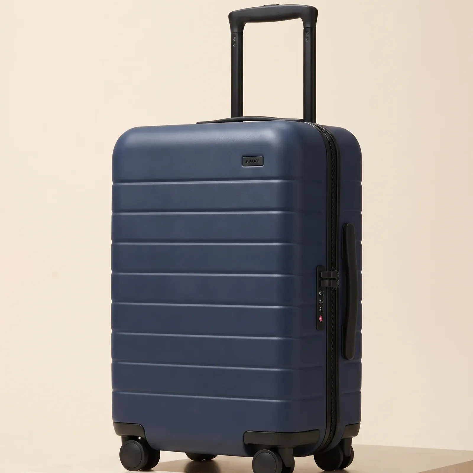
COLLECTION TILE
The Carry-On
$275
COLLECTION
Stay readable as a small tile
Centered scale and a square crop keep the product distinct during fast browsing.
STORE PLACEMENT SYSTEM
One composition cannot do every store job. Build a scannable collection crop, an inspectable product image, and a wider storefront visual from the same recognizable product.
 MADE WITH ADYVI
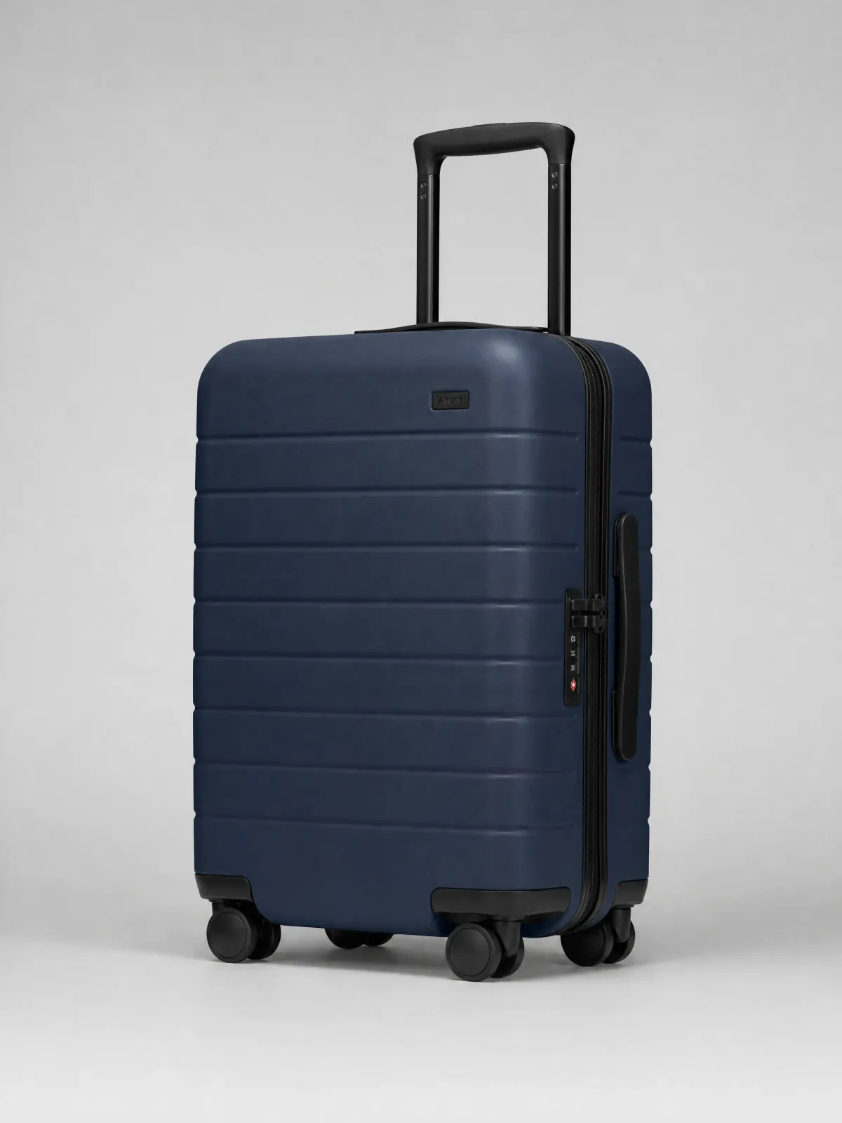 Starting product image
THREE STORE JOBS
Collection browsing rewards instant recognition. Product detail needs inspectable form. A storefront section needs context and room to share with copy.
COLLECTION TILE
The Carry-On
$275
COLLECTION
Centered scale and a square crop keep the product distinct during fast browsing.
PRODUCT DETAIL
The Carry-On
$275
Add to bagPRODUCT DETAIL
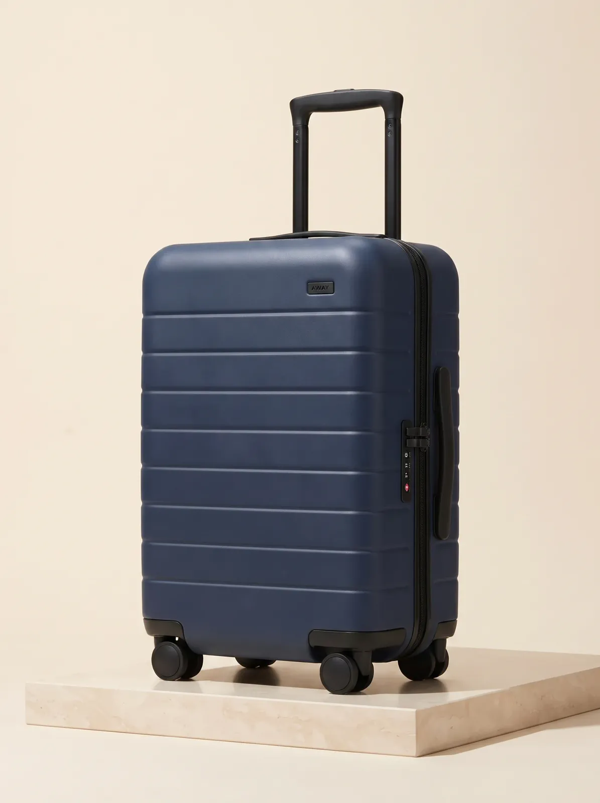
A portrait product-led image gives the complete form and important surfaces more room.
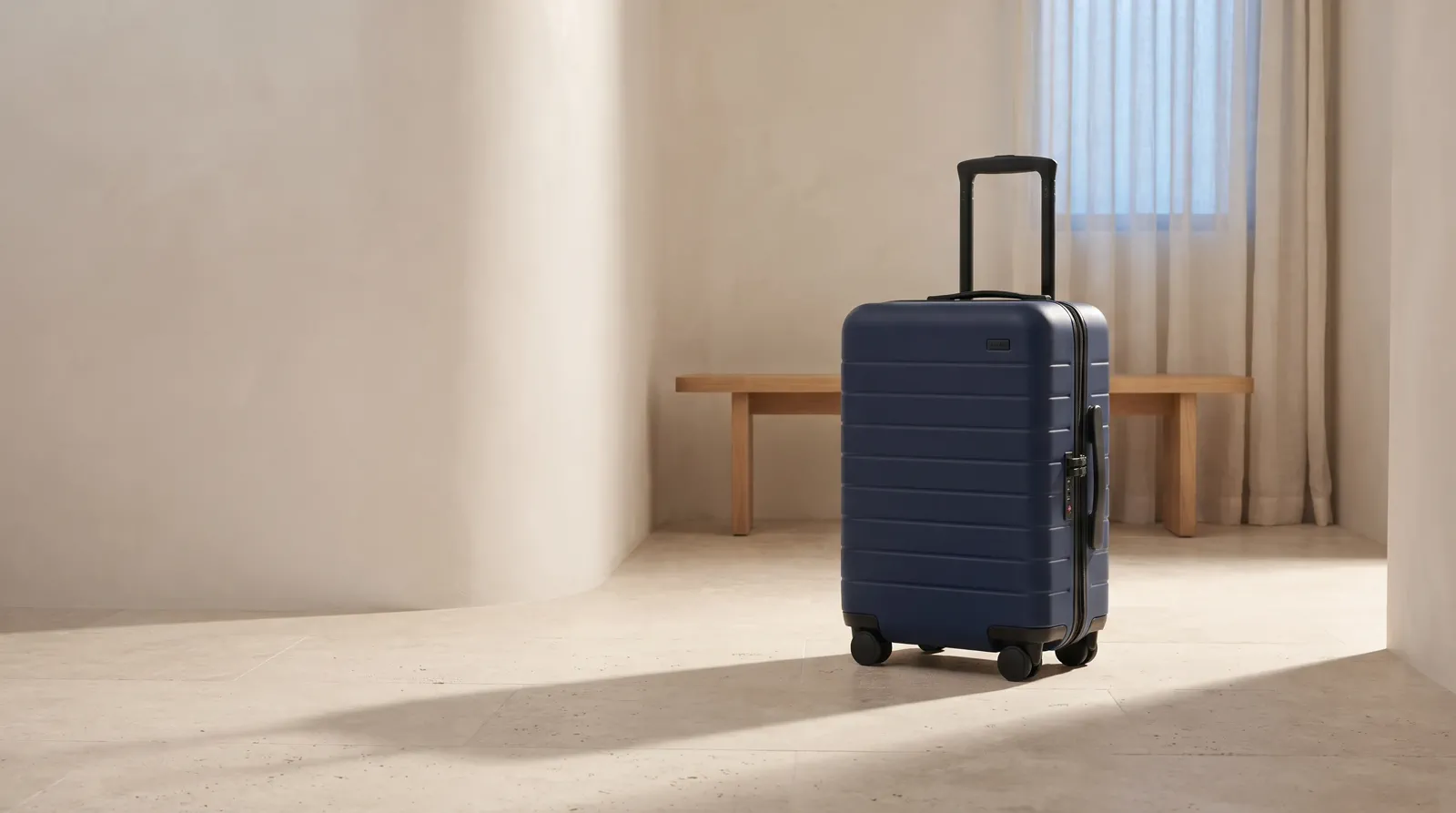
STOREFRONT HERO
Built for the next journey
Shop the collectionSTOREFRONT
A wider image adds setting and deliberate negative space without losing the product.
CUSTOMER EVIDENCE
The comments cover collection readability, wider storefront imagery, and real store use.
“I chose a 1:1 crop with the product centered so it still reads clearly as a small tile in the collection grid. It doesn't turn into a blur when it's shrunk down.”
Tomas_L
Adyvi customer
“For a home-page banner I set 16:9 and asked for a wider scene with more atmosphere. It gave the section mood and space but the product was still the focus.”
Elowen_B
Adyvi customer
“I downloaded the finished image and put it on our Shopify product page and a collection header myself. It's live on the store now.”
Bruno_C
Adyvi customer
CREATE FOR THE PLACEMENT
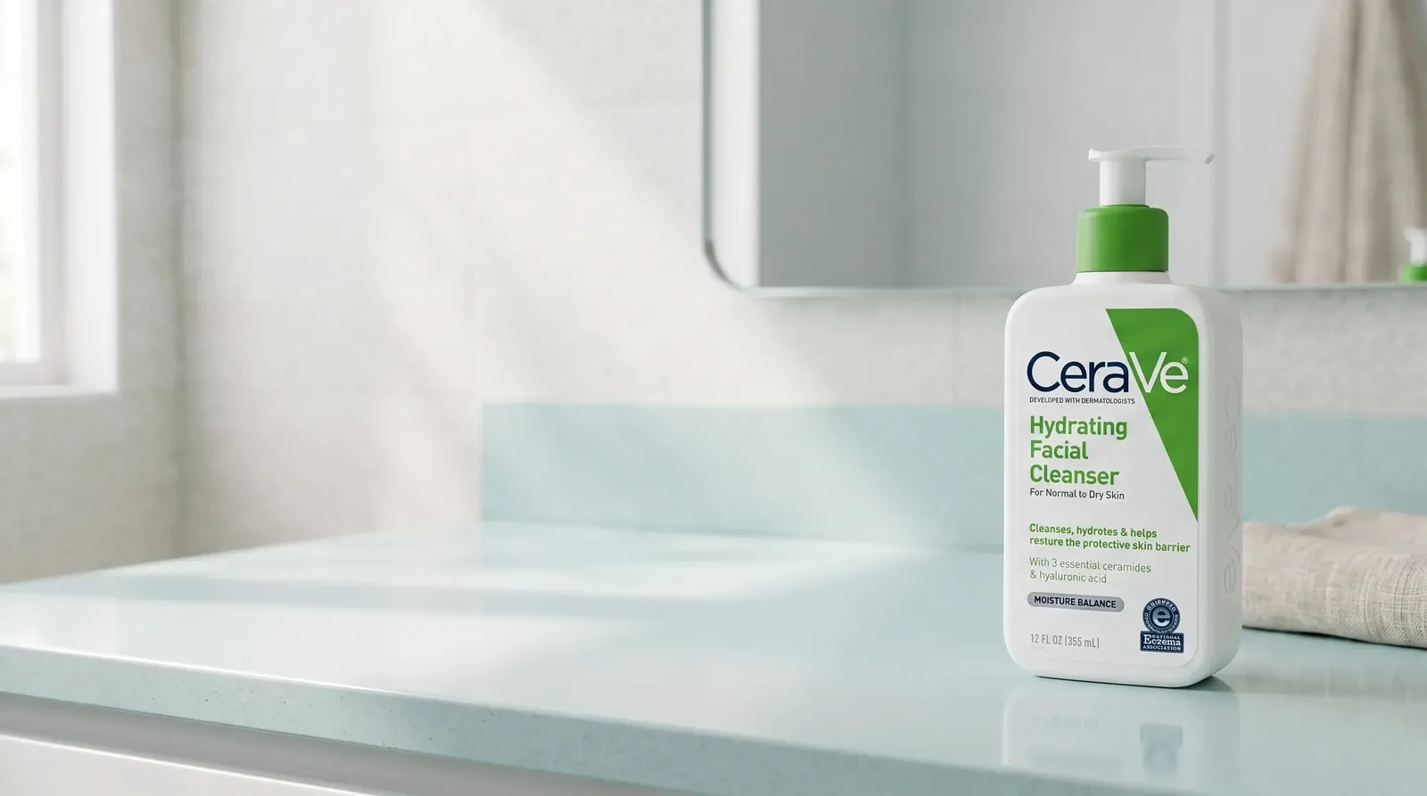
The suitcase above proves one placement system. Here, a skincare product shows how the same storefront logic changes when the shape, scale, and category change.
01 · YOUR PRODUCT
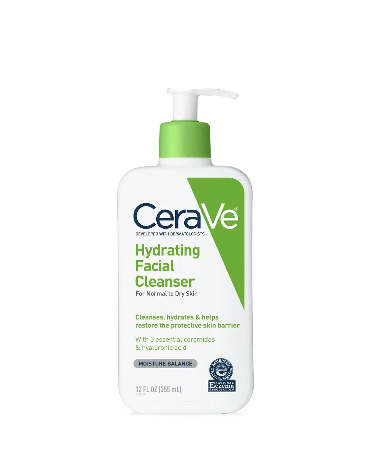 Starting product image
Start with one complete, clear product image that shows the surface that matters.
02 · DESCRIBE THE JOB
“Create a wide skincare storefront image. Keep the complete pump bottle recognizable on the right and reserve a quiet, bright copy area on the left.”
BEFORE YOU CREATE
Plan role, ratio, mobile readability, and visual cohesion before creating.
Plan a scannable collection image, an inspectable product-detail image, and wider storefront or campaign imagery when the layout needs context and copy space.
Choose the slot first. Square often suits collection tiles, portrait gives product detail more room, and wide ratios suit storefront sections that share space with copy.
Yes, when the source clearly shows the complete product. Use a separate focused request for each placement so crop, scale, and negative space have one clear job.
Reduce collection and product images to their real tile size. Confirm the product remains distinct, important detail is readable, and no edge is lost to the crop.
Begin with the same recognizable product and repeat a small set of decisions—light, surface, color mood, and spacing—while changing the composition for each role.
CREATE WITH ADYVI
Start with one product photo and the store placement the result needs to serve.